


Parco Museum Tokya rebrand
2020
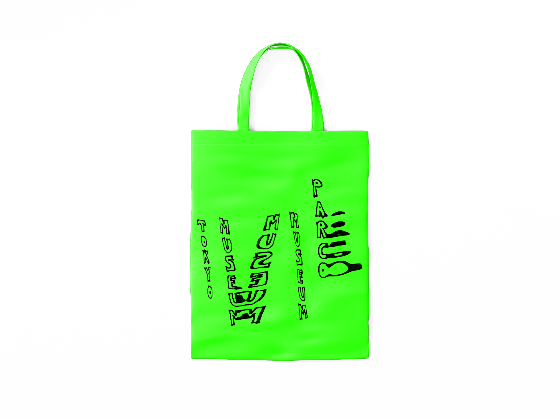
my proposal follows a system of branding where Parco’s logo is everchanging. Parco’s recognition will no longer be by a logo, it will be known by name.
Each exhibition brings with it a new Parco graphic motif. The in-house graphic designer designs this each time along with each exhibition season.
The exhibition posters will follow a system where this graphic motif is displayed along with the introduction of the new artist on show and an image of the artist’s work.
This idea brings forward the graphic designer as artist and an opporuinty for their own creative and expressive freedom, which is often suppressed by clients.
The concept places Parco museum as a progressive institution that embraces creativity and everything new.
It offers a reoccuring role for the graphic designer rather than a once off job or an opportunity for graphic designers to rotate to create their motif or collaborate on one.
A changing logo also creates an air of mystery and excitement to be associated with the gallery. There is no intention for the logo to suggest its maker is on exhibit, but rather to establish what the gallery endorses and the way it values art.
The concept means the graphic designer creates custom work each time, this is more special.
This is the new branding ‘system’. An ever changing logo with all informative text set vertically, and read from top to bottom, right to left, even when text is in English. This setting of text is a constant element that maintained in the gallery’s branding.
2020
my proposal follows a system of branding where Parco’s logo is everchanging. Parco’s recognition will no longer be by a logo, it will be known by name.
Each exhibition brings with it a new Parco graphic motif. The in-house graphic designer designs this each time along with each exhibition season.
The exhibition posters will follow a system where this graphic motif is displayed along with the introduction of the new artist on show and an image of the artist’s work.
This idea brings forward the graphic designer as artist and an opporuinty for their own creative and expressive freedom, which is often suppressed by clients.
The concept places Parco museum as a progressive institution that embraces creativity and everything new.
It offers a reoccuring role for the graphic designer rather than a once off job or an opportunity for graphic designers to rotate to create their motif or collaborate on one.
A changing logo also creates an air of mystery and excitement to be associated with the gallery. There is no intention for the logo to suggest its maker is on exhibit, but rather to establish what the gallery endorses and the way it values art.
The concept means the graphic designer creates custom work each time, this is more special.
This is the new branding ‘system’. An ever changing logo with all informative text set vertically, and read from top to bottom, right to left, even when text is in English. This setting of text is a constant element that maintained in the gallery’s branding.