

Moderna Museet rebrand
2020
I researched into the museum’s branding history and stumbled upon a double MM as one of the museum’s past identiies.
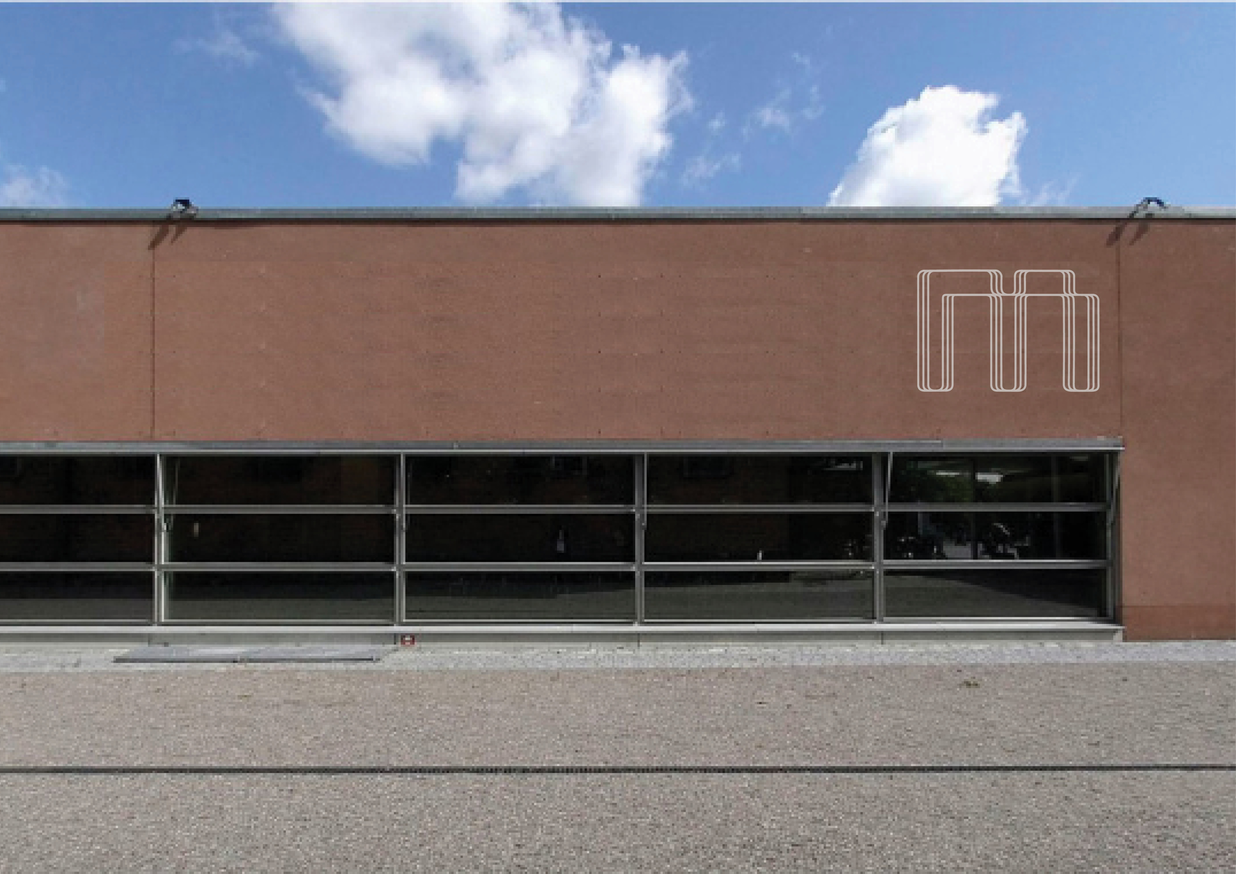
I was caught by the simplicity of this idea and appreciated the way in which the letters became pictorial - ideal for a logo.
After experimentation by hand on grid paper, I decided to play with Wim Crouwel’s ‘M’ from vormgevers as I really liked the fluidity of it. This also seemed appropriate considering Crouwel’s past collaboration with Moderna Museet in 2012 via his typeface Gridnik.
To compact the logo I played with two stacked ‘M’s instead of having them side by side. I originally trialed the stacked ‘M’s as block letters filled in, but decided to focus on the linework exclusively as it looked less comical and more interesting to me.
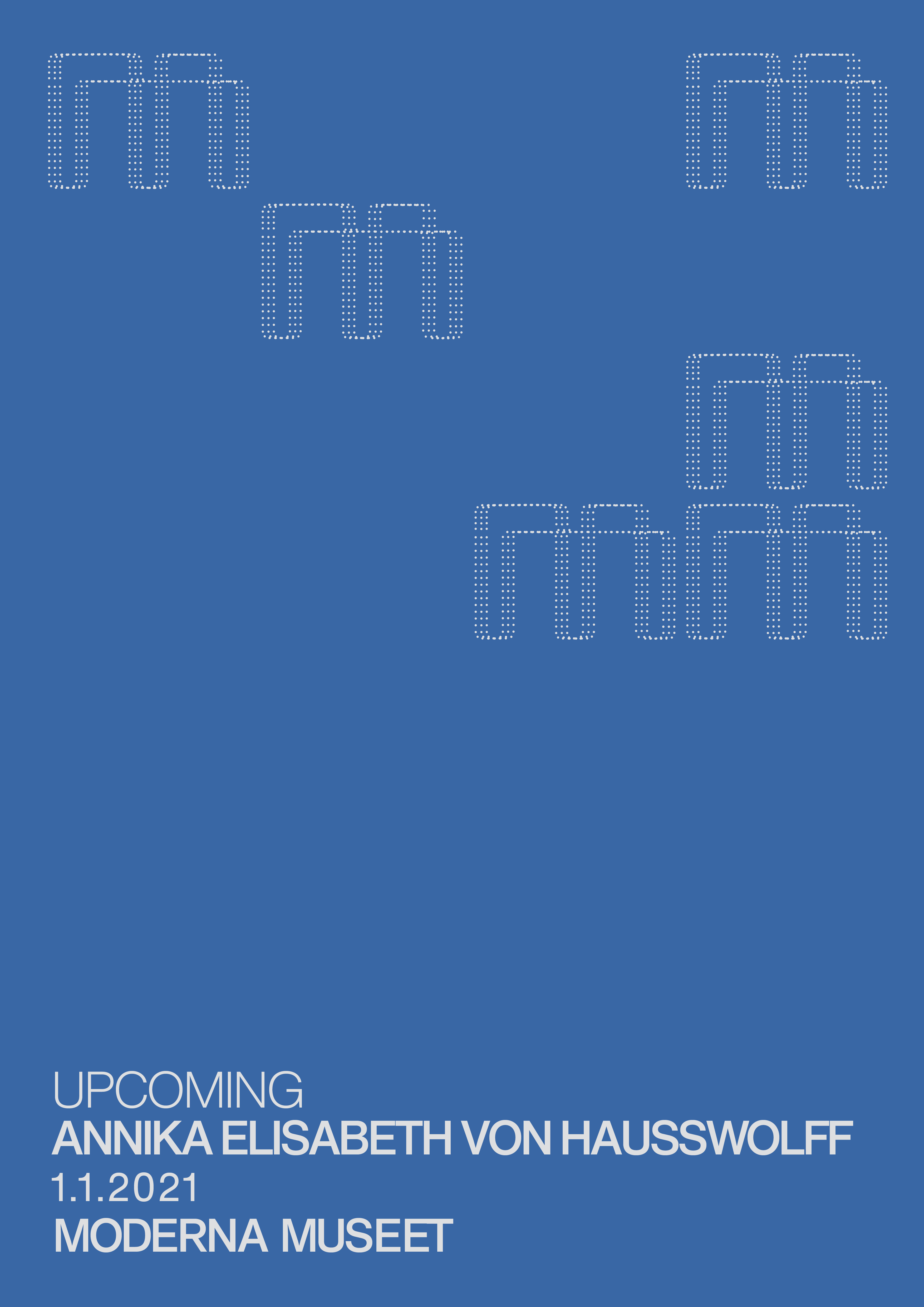
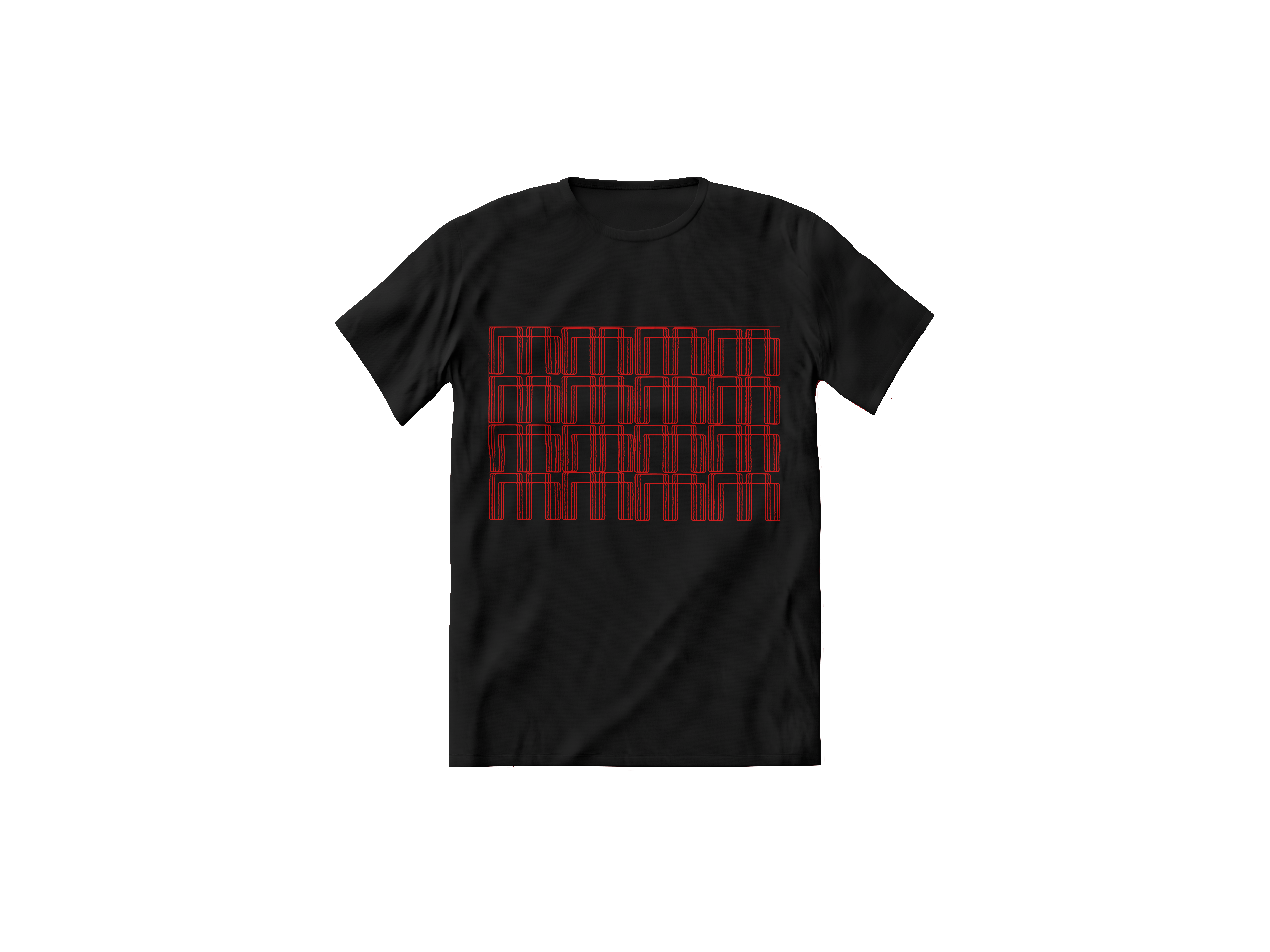
I continued to utilise the logo as a pictorial element and played with ways it could create more artistic formations.
With this exploration I developed a monogram for the brochure cover and various formations for posters and ephemera.
My two colour choices offer options for seasonal use and present the way this rebrand can be refreshed over time.
